| | I made this..... for the glory of the site! |  |
|
|
| Author | Message |
|---|
Hecate

Posts : 47
Join date : 2011-10-23
Age : 33
Location : Calibunga doods!
| Subject: I made this..... for the glory of the site!  Sun Oct 30, 2011 5:47 am Sun Oct 30, 2011 5:47 am | |
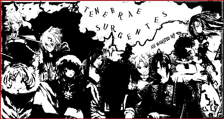
| Because I was bored, and I felt the banner could use an update.... No offense XD This one has a red border. - Spoiler:
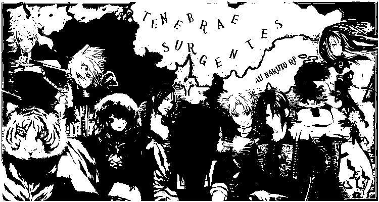
And this one has a white border. - Spoiler:
Choose your favorite, I don't know if we will use them, but I thought they were neat. If you do want to use them, then by all means feel free XD | |
|
| | |
Sora Nomaku
Admin

Posts : 97
Join date : 2011-10-09
| | Subject: Re: I made this..... for the glory of the site! Sun Oct 30, 2011 9:06 am | |
| I like it. I feel the Black and White is a little hard on the eyes, but other then that it looks amazing. I think we'll use it. | |
|
| | |
Kitoroga Shirokami
Pre-Approval Admin

Posts : 74
Join date : 2011-10-09
Age : 30
| | Subject: Re: I made this..... for the glory of the site! Sun Oct 30, 2011 3:01 pm | |
| I like that a lot myself. But where am I? >=( Am I not important enough? XD
Like Sora said, the black and white is a little harsh but I still like it, call me a glutton for punishment xP | |
|
| | |
Hecate
Posts : 47
Join date : 2011-10-23
Age : 33
Location : Calibunga doods!
| | Subject: Re: I made this..... for the glory of the site! Sun Oct 30, 2011 3:59 pm | |
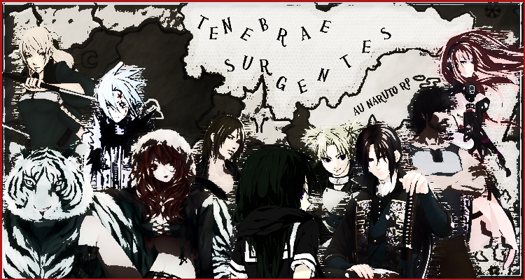
| I tried to make it sepia but photoshop didn't like that for whatever reason >.> I could attempt to soften it with a filler if you guy want? To make it less harsh or just turn down the contrast. Edit: Bam =D Here is a softer version that retains some color. - Spoiler:
Here is a version that is pure color, though I feel it a bit lacking myself >.> - Spoiler:
| |
|
| | |
Kitoroga Shirokami
Pre-Approval Admin
Posts : 74
Join date : 2011-10-09
Age : 30
| | Subject: Re: I made this..... for the glory of the site! Sun Oct 30, 2011 5:08 pm | |
| See, there we go! I was hidden when it was black and white XD I blame my gruff and manly exterior  See, I actually like the full colored one the best actually. I feel like you can see everyone and everyone stands out. | |
|
| | |
Hecate
Posts : 47
Join date : 2011-10-23
Age : 33
Location : Calibunga doods!
| | Subject: Re: I made this..... for the glory of the site! Sun Oct 30, 2011 5:09 pm | |
| Well if you guys like it then have at it, I can always adjust or work on another one, considering I save all my files as PSD's | |
|
| | |
Hecate
Posts : 47
Join date : 2011-10-23
Age : 33
Location : Calibunga doods!
| | Subject: Re: I made this..... for the glory of the site! Sun Oct 30, 2011 7:07 pm | |
| Three side icons.. I don't know how fantastic they are, but I hope they work. Again criticism is welcome. - Spoiler:
I honestly feel they are too plain, mostly in the background department, but meh. If you guys can think of anything to improve upon them then be my guest. | |
|
| | |
Hecate
Posts : 47
Join date : 2011-10-23
Age : 33
Location : Calibunga doods!
| | Subject: Re: I made this..... for the glory of the site! Sun Oct 30, 2011 7:29 pm | |
| TRIPLE POST ALL THE WAY. - Spoiler:
made a background, don't know how well it will look, but again I can always make another one, or just refine this one more. Edit: - Spoiler:
This should look better with the dark background >.> | |
|
| | |
Sponsored content
| | Subject: Re: I made this..... for the glory of the site! | |
| |
|
| | |
| | I made this..... for the glory of the site! | |
|